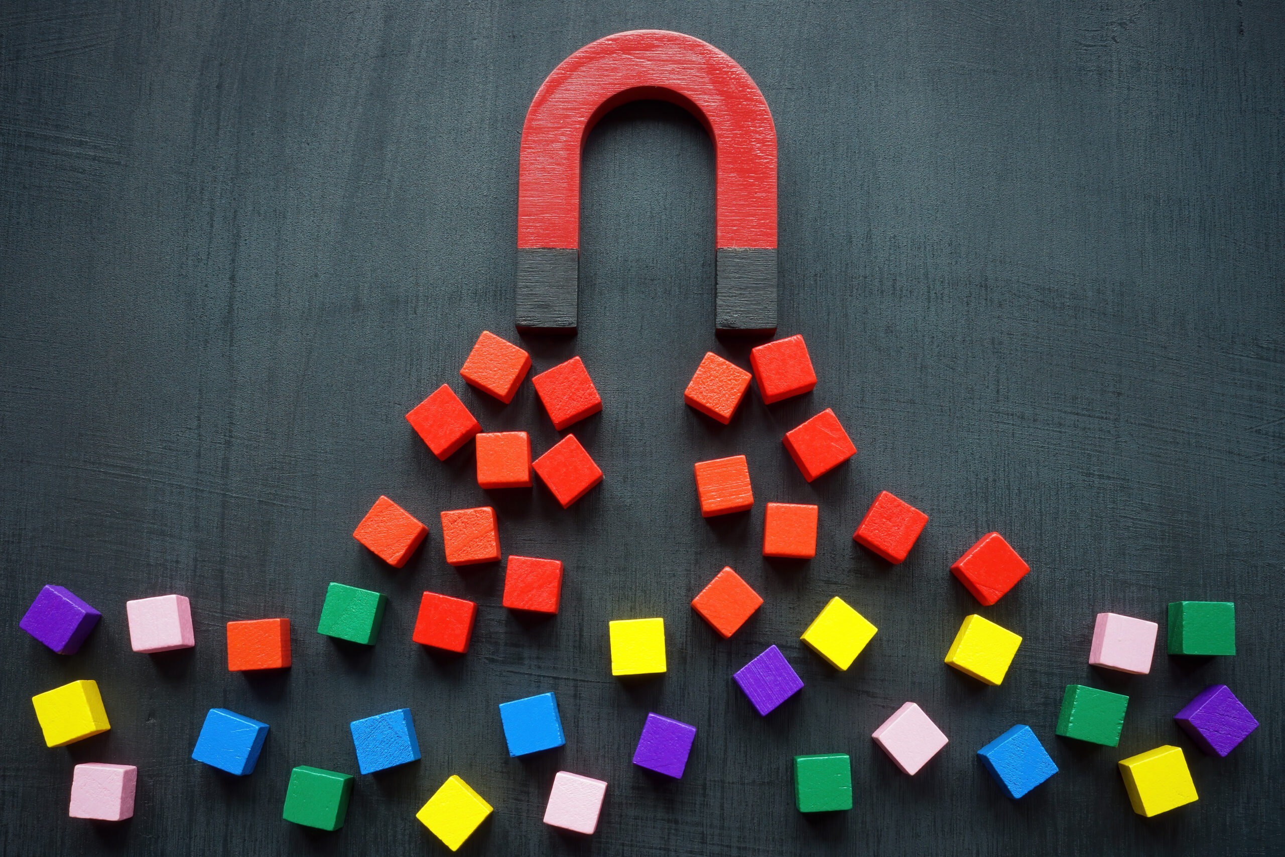
Can you think of a brand that uses red and white in its logo? At least 3 brands must have come to mind even before you finished reading this sentence. Color is one of the first things we notice and it evokes various emotions in us even before we realize it. The subfield of behavioral psychology that studies this in detail is color psychology.
Many successful brands apply color psychology while designing a website, social media posts, products, and marketing materials to elicit the emotions that are advantageous to them. Think about McDonald’s and its tall golden-yellow arches on a red background. The color red makes us feel hungry and yellow induces happiness. Banks such as Bank of America and Citi have blue in their logos because that color elicits trust, dependability, and security.
If you are still wondering how color psychology can be useful in business, then keep reading. We will be taking a deeper dive into how sales and marketing professionals can strategically use color psychology to increase conversions and drive sales.
The Effect of Colors on Conversion Rates
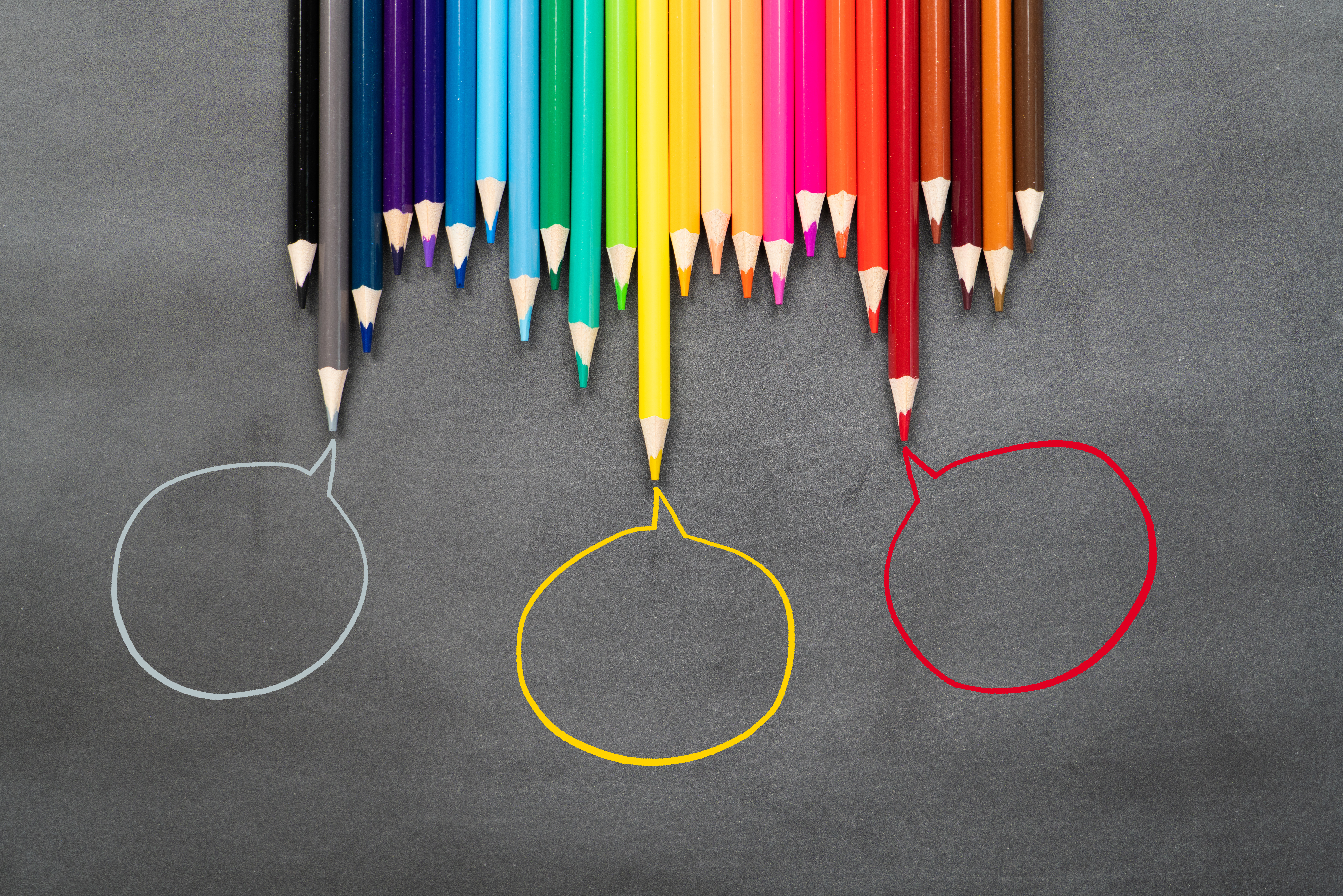
A prominent psychiatrist named Carl Jung said “Colors are the mother tongue of the subconscious.” This is why as a marketer or salesperson, you should use color psychology while designing websites and marketing materials. By doing it right, your lead conversion efforts become more effective. You can attract leads and trigger certain emotions that might convince them to make the purchase, register, sign up for a consultation, or subscribe. So let’s take a closer look at each of the important colors that can be your allies in your goal of hitting that high conversion rate.
| Color | Positive Traits | Negative Traits | Why Use It |
Blue |
Peace, reliability, creativity, trust, strength, confidence, and security. | Sadness, coldness, and emotionlessness. | Blue draws emotions such as stability and responsibility that make it easier for potential clients to trust you with their homes. |
Black |
Elegance, glamor, maturity, power, and design. | Evil, death, and mourning. | Using black shows your brand can incorporate fashion and elegance through your services. Many potential customers want these qualities in their homes. |
Green |
Healthy, freshness, fertility, abundance, and prosperity. | Sickness, envy, and stagnation. | Green works better if your brand manufactures products using eco-friendly ways or made of recycled materials. |
Red |
Love, caution, impactful, exciting, and powerful. | Violence, anger, and danger. | Red grabs attention, creates an impact, and makes your brand seem energetic. A big red “sale” tag will make your discount offers more effective. |
Yellow |
Happiness, energy, friendliness, optimism, intellect, creativity, and originality. | Anxiety, caution, and cowardice. | Brands selling building and construction appliances should use yellow as it shows intelligence and creativity. It’s also the perfect color to use for announcing summertime offers. |
Orange |
Energy, happiness, warmth, positivity, youthfulness, and innovation. | Frustration, immaturity, ignorance, and sluggishness. | Orange can be used as a complementary color to create urgency. It’ll work well during your Autumn offers and on your landing page. |
Purple |
Exclusivity, royalty, luxury, wealth, wisdom, and sophistication. | Arrogance, inferiority, and restrictive. | Purple stands out when telling your audience about your premium offerings and high-end services. |
White |
Innocence and purity, simplicity. | Plain, boring, empty, and distant. | Web pages and emails about your premium goods and services will look appealing with a combination of white with accent colors. |
(CTA – “Download this free color guide for your reference.”)
Best Practices For Using Color To Maximize Conversions
At this point, you’re probably thinking about how to use the psychology of color to increase website conversions. Now that you know about color’s connection with human emotions, the next step is to decide on the colors that align with your brand and message. Take into consideration the various factors related to your target audience. Once you’ve determined the colors, run a few tests to see if they are really effective. Let’s take a closer look at some of the things you have to keep in mind when choosing colors.
Choice Of Colors For Call-To-Action Buttons
Your landing page is important as it convinces visitors to perform actions like making a purchase, booking a consultation, subscribing to a newsletter, and more. Therefore, it is vital that you take color psychology into consideration when deciding on your call-to-action button color for such pages. Your brand’s image and key messaging will also need to be taken into consideration. It must be ensured that the colors of the entire page complement the CTA button color. Pick a color that contrasts with the rest of the webpage colors, so it naturally attracts attention.
Which is the best call-to-action button color according to research? Well, there is no single best CTA button color. The perfect color for you depends on multiple parameters, but these are generally the most used colors – red, yellow, orange, and green. These are easy to spot on most backgrounds. The least used are brown, gray, black, and white as these blend with the other colors on your page.
Maintain Consistency Of Color Across Marketing Materials
The color scheme used on your landing page must be similar to the one used on other pages, emails, social media posts, brochures, and other marketing materials. This creates a consistency that greatly helps in boosting brand recognition by up to 3.5 times.
When we thought of brands with red and white colors logos, we thought of Coca-Cola, Netflix, and H&M within a couple of seconds. This is because that’s how well these brands have communicated their colors through their marketing, websites, and products. You can pick up a can of Coca-Cola, go to any random page on their website, open any of their ads, and you’ll find the same color scheme and similar design language across all of these. On the other hand, a lack of consistency can look odd and jarring. It could affect your potential customers’ purchasing decisions negatively.
(CTA – “Sign up for our newsletter for more of such insightful tips.”)
Analyze Your Target Market Demographics
A really attractive CTA button might not be clicked if the colors fail to resonate with your leads. This is why you have to take into account your target audience. White is seen as a mark of purity in western cultures, but the Chinese people associate it with death and mourning. Cultural difference is one of the many factors that affect how one reacts to colors. Gender plays a huge role too. For instance, research has shown that 23% of women prefer purple, but not even 1% of men chose this color. Age, spending habits, and past personal experiences also come into play.
Once you have found the colors that align with your brand personality and with your key messaging, there’s still one final step left to be done. You need to test your designs to increase your chances of success.
Testing And Optimizing Your Color Choices
A/B testing, which is also known as split testing, and multivariate testing are used to gauge the effectiveness of color choices. In the first testing process, you use two variations of a single variable and see how they perform. It will be conducted by randomly dividing your sample size into two groups. Let’s say that you’ve decided on two colors for your CTA button. You put both versions of your landing page on your website, one with a red CTA button, and the other with a green one. You can see the results in real time and know which should be used for all your CTA buttons.
In multivariate testing, you use multiple variations or different variables to find which combination is the most effective. Testing techniques like these show if you are on the right track or if the colors are not working out. You can use tools like Google Analytics to see how your webpages are performing and modify the colors for better results.
(CTA – “Call today to book a consultation with us.”)
In Summary
Many things have to fall into place for a successful conversion, and having a color scheme that resonates with your brand, message, and audience is one of them. As a sales and marketing professional, making strategic use of color psychology can help you elevate your brand and unlock higher conversion rates. So go ahead and experiment with a splash of color – it can truly make all the difference in your marketing efforts!
FAQs
Why are colors so powerful?
Colors are an integral part of our life. They convey information, elicit feelings, and are used to express feelings. Colors help us identify things, and affect our thoughts and decisions. These are some of the main reasons why colors are powerful.
What are the benefits of using a planned color scheme?
One of the biggest benefits of using a planned color scheme is that it brings consistency to your creation. It makes communicating a brand’s message easier. A well-chosen color scheme improves the experience of the user. If the designer has used a unique color scheme, then it makes it easier for your brand to be unique and recognizable. With so many benefits to offer, using a planned color scheme is one of the most common conversion rate optimization strategies.
What color attracts people to a website?
There are many colors that make a website attractive, but red attracts people the most. Keep in mind that people will only be on a website for a short time if the color doesn’t go well with the brand and what it is offering.
Does color increase brand recognition?
Yes, it does. Color is usually the first thing we notice about anything. We process it faster than we process other visual elements like shapes and texts. People can even recognize famous brands like Facebook, Coca-Cola, and Google just from the color palette of their logos.
External Links and References:
Interested in learning more about color psychology and its relation with conversions? We recommend checking out some of these additional resources:
Color Psychology: How To Use it in Marketing and Branding | HubSpot
Color Choices In Construction Logo Design | DesignMantic: The Design Shop
How Colour Psychology in Web Design Can Increase Conversions | Forge and Smith